Sammy the Saint sure has some mysterious origins. From all we know, he’s been around Santa Maria since before we were born. Santa Ana High School, who also uses a similar Sammy the Saint design, mentioned on their website that the design was done through a contest that happened in the 1940’s. However, Sammy the Saint has been around SMHS as early as 1907, stated by Cindy Ransick in one of our articles, “Where Did Sammy The Saint Get His Beginnings?” written by Gabriela Rojas. It’s unsure on who used him first. However, I’m not here to talk about where he comes from but instead to analyze the design.
Sammy the Saint as we know it, is a…saint. I remember hearing students that they didn’t even know he was a saint, they just thought it was some random kid, perhaps a student. There’s sometimes a weird mix-up between a saint and an angel. I know for a fact I got mixed up. He has that typical angel like face you’d see on cartoons, something out of Fantasia. Perhaps, it was his halo that was throwing me off. The website, Christian Pure, summarizes that “Saints are ordinary individuals who have achieved extraordinary levels of holiness through their unwavering faith and selfless acts, while angels are pure spiritual beings. So, I guess that settles it, Sammy the Saint must’ve done something extraordinary to have been given that title of being a saint. If you do a quick google search of angels and saints, you’ll notice right away they’re two completely different things. So as far as we know, Sammy is just some random person that got the title saint. Do we know why, no. I’m sure they just wanted some noun that started with an “S” to go along with the name, Sammy. That sounds better than “Sammy the Angel”. I remember hearing in middle school that his design looked like a Smurf. I personally don’t really see how he looks a Smurf. If all things he looks more like Elmer Fudd from the Looney Tunes cartoons. They pretty much have the same face and head shape when compared. You could say he looks like a mascot for a sports team, but I mean, you could say that with almost any mascot.
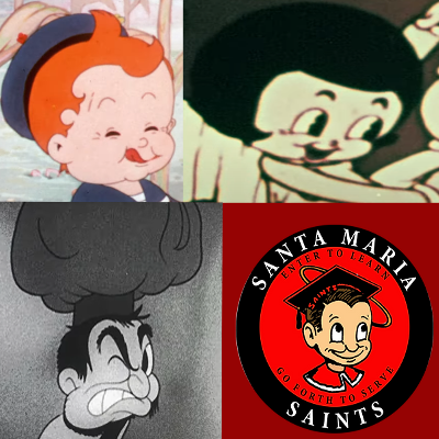
Oddly enough, that head shape that Sammy has does seem to have been a rather common one especially for animation studios, like Fleischer Studios. If you don’t know who they are, they’re an American animation studio that was founded by two brothers in 1929, Dave and Max Fleischer. They were the ones that made the Popeye and Betty Boop cartoons. For example, in the cartoon, Somewhere in Dreamland, one of the main characters from the cartoon is a boy who lives in poverty alongside his mother and sister. If you watch the cartoon and compare him to Sammy, you’ll see a small resemblance. Another good example are the children in the cartoon, The Kids In The Shoe. The children’s faces are seen as round and puffy, similar to Sammy. I’m starting to sense a pattern here. It seems for the children; they’re usually depicted with very round and puffy faces. So, does that mean Sammy is a kid? Well, I wouldn’t entirely say so. I feel like it would be a bit strange for a kid to be the mascot for a high school. I’d say the artist just wanted to have fun with the design and made him look very child-like. Granite Hotel provided a few examples of adults having that similar round and childish like face. I didn’t have any luck finding depictions of a teenage character in the rubber hose art style. I’m sure there’s a few out there.
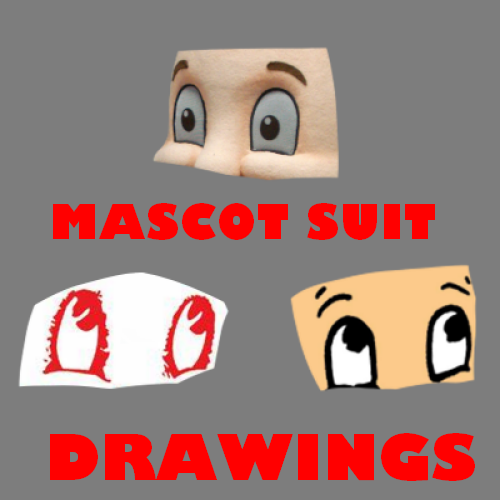
Sammy has this weird thing where there’ll be designs where his pupil will be a full circle and then sometimes will have that small gap in the middle (also known as Pac-Man eyes) like most 1930’s cartoons had. I’ve always thought that the missing gap looked much better. It just fits better with Sammy and honestly makes him look a bit unique rather than the usual circle pupil. The mascot suit is an interesting case. The pupils have a white highlight. I suppose it makes sense to include it, to give the illusion of cartoon having human like features.
If there’s something we’re unsure about Sammy’s design is the main body. We’ve never had like a full reference picture. I know there were some sheets of paper that actually had a half body image. There’s SMHS merchandise that shows a full Sammy render but not with the usual cap and gown outfit. We’ve seen him in casual clothing and surprisingly, a tuxedo. We assume he’s inspired from 1930’s cartoons as I mentioned earlier about his resemblance to Fleischer Studio characters. I’d just imagine that he has a similar body structure to that of Mickey Mouse. You could try to make out how a full render of Sammy would like by looking at the mascot suit, but not even the suit is completely accurate because the times it’s been seen, it’s usually missing that thing that goes around the neck. It looks like some kind of tie of sorts.
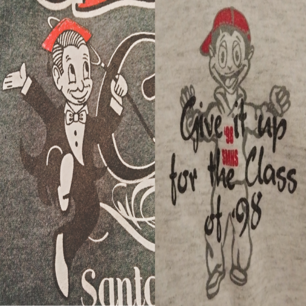

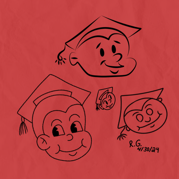
The drawings that I’ve made of Sammy the Saint, aren’t completely accurate. I try my best to draw him accurately, but it makes it difficult when you have very few reference pictures to work with. Sometimes you’ll see him with four fingers, and sometimes with five fingers. Sometimes he’ll have the word, “SAINTS” on his cap and sometimes he won’t. Sometimes you’ll see his hair have a split and sometimes he won’t have it. Heck, sometimes you’ll see him with red hair! You just have to imagine on how he truly looks. I can’t really complain, it gives me liberty to how I’d want him to look in the cartoons that I make.
This concludes my analysis on Sammy’s design. As mentioned above, he’s a character we don’t really have much information on which is a bummer. We don’t know the exact inspiration behind Sammy, but from what I mentioned above, I think we have a good understanding of what he was inspired from. I hope in the future we get much better renditions of him just so in the future if students or staff want to do more creative media with him. But perhaps he doesn’t have to be accurate. Maybe it’s up to us to figure out how we want to interpretate the Saint.


